Statistical Anomaly Detection, Time Series Analysis, Physics-Based Energy Modelling, Performance Ratio Analysis, Loss Waterfall Decomposition, Fleet Benchmarking, Root Cause Classification, Data Pipeline Design, Precision / Recall / F1 Evaluation, Synthetic Data Generation
Technologies/Tools
Python, pandas, NumPy, Matplotlib, Requests, NASA POWER API, GitHub
Preview
This is an AI-assisted simulation project built to develop familiarity with the processes, methods, and terminology used in solar asset performance management. Key objectives included detecting and classifying synthetic fault events using three statistical methods, and quantifying their financial impact through Performance Ratio analysis.
Technologies & Domain Concepts
Languages & Libraries
PythonpandasNumPyMatplotlibRequests
Statistical Methods
CUSUMRolling Median Control ChartZ-Score AnalysisLinear RegressionPrecision / Recall / F1 Evaluation
Solar Domain
Performance Ratio AnalysisLoss Waterfall DecompositionSpecific Yield BenchmarkingPhysics-Based Energy ModellingFleet BenchmarkingSolar Asset Performance Management
Data & Pipeline
NASA POWER APIMulti-Stage Data PipelineSynthetic Data GenerationGround Truth InjectionGitHub
Project Report: Solar Asset Performance Anomaly Detector
Purpose and Design Goals
This project simulates the end-to-end analytical workflow of a solar asset performance team. The goal was to build familiarity with the terminology, methods, and decision patterns used in analytics developer roles at solar asset managers, by constructing every stage from scratch rather than using pre-built frameworks.
The core analytical loop at a solar asset manager looks like this:
Weather data
Expected output
Compare with measured output
Detect underperformance
Rank severity
Identify cause
Quantify financial impact
Prioritise O&M action
Each stage of this project maps to one node in that loop.
What each pipeline stage does and which sites it covers
Rolling median, z-score, CUSUM detection layers; OR-combined flag; severity rating
Yes
Yes — inline in Stage 5
Stage 3 — Episode Triage
Group flagged days into fault episodes; root cause classification; revenue loss
Yes
No
Stage 4 — Loss Waterfall
Decompose E_expected → E_actual into labelled loss buckets; annual breakdown
Yes
No
Stage 5 — Fleet Benchmarking
Compare all three sites on PR, specific yield, and portfolio loss
Aggregated
Aggregated
Stage 1: Data Ingestion and Simulation
The data source
Weather data comes from NASA POWER (Prediction of Worldwide Energy Resources), a public API that returns gridded satellite-derived climate data for any lat/lon without authentication. Two variables are used:
ALLSKY_SFC_SW_DWN: Global Horizontal Irradiance in kWh/m²/day. This is the total solar energy reaching a horizontal surface — the fundamental input to any energy model.
T2M: Air temperature at 2m, used for the panel temperature correction.
Why not use hourly data? Daily aggregation is standard for asset performance monitoring. Single-inverter failures, soiling, and curtailment events all persist for days to weeks — sub-daily resolution adds noise without improving detection for these fault types. Hourly data becomes important for curtailment detection (a grid signal that arrives and clears within hours) and for production forecasting, but not for the multi-day anomaly detection this project focuses on.
Where temperature_correction = 1 + (−0.004 × (T2M − 25)), clipped at 0.85.
Three design decisions here worth understanding:
Decision 1: GHI not POA (Plane-of-Array) irradiance.
In real asset management, irradiance is measured at the panel surface angle (POA). A fixed south-facing panel at 30° tilt receives more annual energy than a horizontal surface because it's angled toward the sun's arc. POA is 10–20% higher than GHI for a well-oriented system. This project uses GHI because the NASA API provides it without needing tilt/azimuth transposition. Real performance models (PVSyst, SAM) always use POA.
Decision 2: No PR term in E_expected.
The expected output formula intentionally excludes the 0.80 baseline PR. E_expected represents what the panels could produce given the available light and temperature — it is a physical ceiling, not an operational forecast. Performance Ratio is then the measured ratio of actual to expected, and it naturally settles near 0.80 for a healthy farm. If you included PR in E_expected, you'd be building 0.80 into both sides of the fraction and PR would always equal 1.0.
Decision 3: Temperature coefficient −0.004/°C.
Standard monocrystalline silicon panels lose about 0.4% of output per degree above 25°C. This makes a meaningful difference: in summer at 35°C, the correction is 0.96 (4% efficiency loss). At Okanagan's average T2M of 3.9°C, the correction is 1.084 — panels are nearly 9% more efficient than STC conditions on an average day. This is why E_expected > E_stc throughout the year at this cold site.
Fault injection
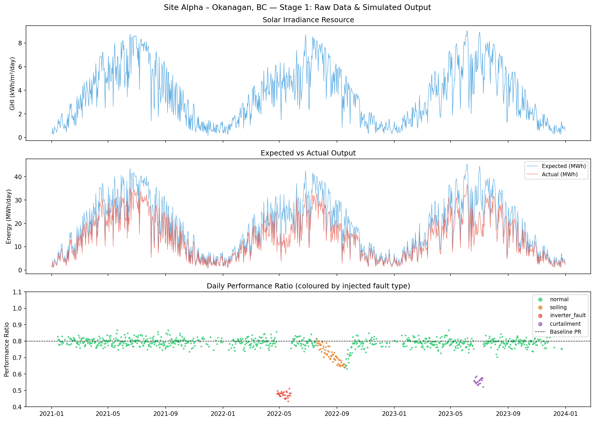
Three faults are hard-coded into the simulation with known windows, creating ground truth for later validation:
Three fault events injected into the simulation — known ground truth used to validate detection accuracy
Fault Type
Days
Calendar Period
Mechanism
PR During Event
Fault Days
Soiling
565 – 625
Year 2, days 200 – 260
Linear PR ramp 1.00 → 0.82 over 60 days, 20-day recovery
0.720 mean
60
Inverter Fault
480 – 510
Year 2, days 115 – 145
Step-down to 0.60× — sudden 40% output loss
0.476 mean
30
Curtailment
900 – 920
Year 3, days 170 – 190
Output capped at 70% by grid operator instruction
0.556 mean
20
Total injected fault days
110
Site Alpha — 3-year simulated output: daily irradiance, expected vs actual energy (MWh), and Performance Ratio coloured by injected fault type.
Why simulate faults rather than use real SCADA data? Because with real data, you don't know ground truth. You can't compute precision and recall on a real dataset unless you have manually validated fault logs. By injecting known faults, every detection can be evaluated as correct or incorrect. This is how detection systems are developed and tuned before deployment on real sites.
Linear degradation (0.5%/year): Industry standard for crystalline silicon panels. Degradation is subtle — over 3 years it accumulates to ~1.5% total PR loss, which is difficult to detect but meaningful financially.
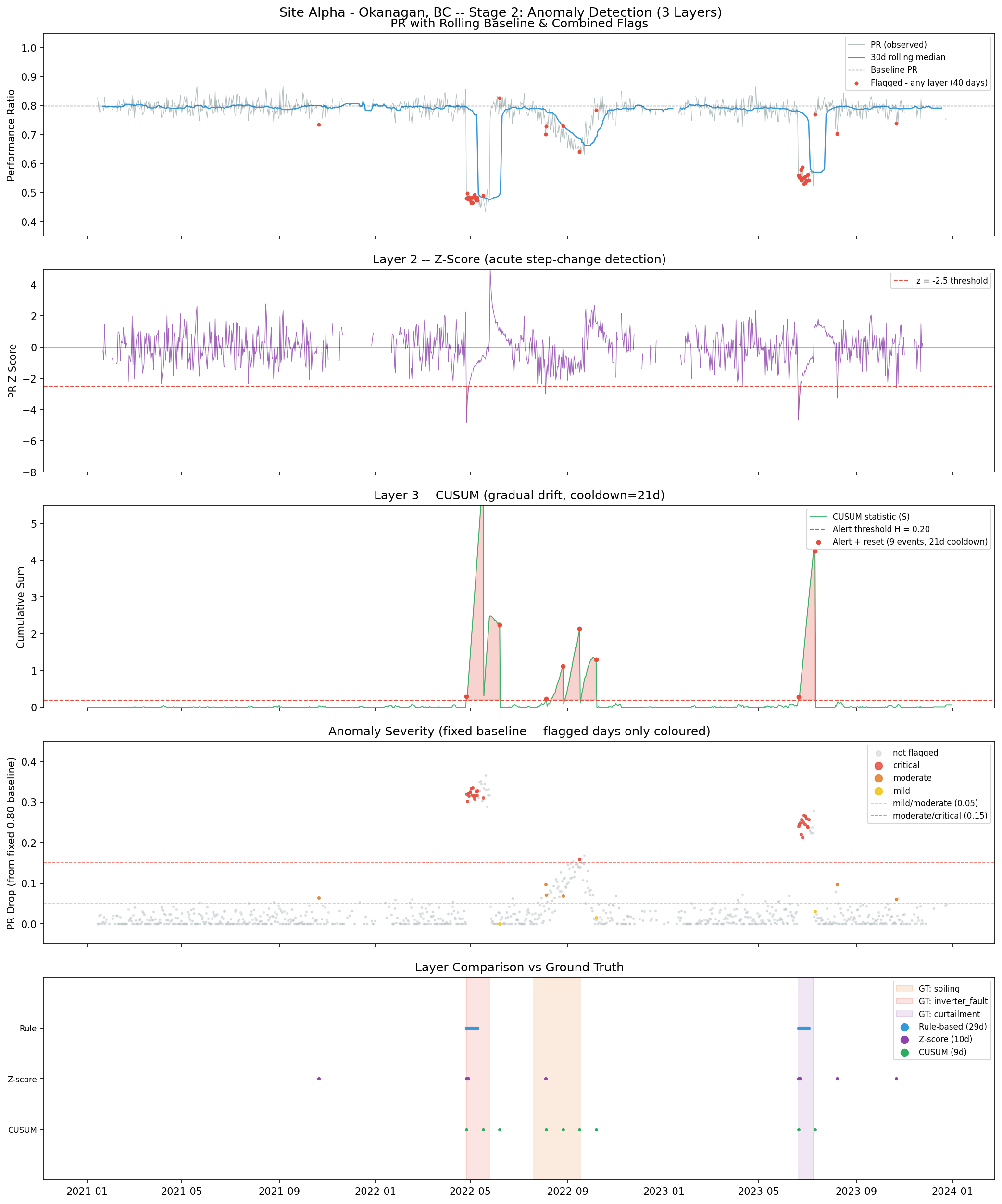
Stage 2: Anomaly Detection
Three detection layers run independently and are combined with OR logic. Each is designed to detect a different class of fault.
Precision, recall and F1 per detection layer vs. ground-truth fault labels. Evaluated on days with valid GHI ≥ 1.0 kWh/m²/day only (109 true fault days, 798 true normal days).
Detector
TP
FP
FN
Precision
Recall
F1
Strength
Weakness
Rule-based (rolling median)
29
0
80
1.000
0.266
0.420
Zero false alarms
Baseline tracks soiling down — alarm masking
Z-score
7
3
102
0.700
0.064
0.118
Sharp on step-changes
Rolling std widens during persistent faults
CUSUM
6
3
103
0.667
0.055
0.102
Catches gradual drift
21-day cooldown limits day-level recall
Combined (OR of all three)
34
6
75
0.850
0.312
0.456
Best overall; acute faults well-detected, soiling largely missed
Stage 2 — five detection panels: PR with rolling baseline and combined flags, z-score statistic, CUSUM accumulation and resets, severity classification, and per-layer detection vs ground truth.
Layer 1: Rolling Median Rule-Based Detector
PR_rolling_median  = trailing 30-day median of PR
flag_rule = (PR_rolling_median − PR_observed) > 0.10
Why median, not mean? A single severe day (say PR = 0.35 from a passing storm) would drag the rolling mean down, reducing the baseline and suppressing future flags. The median is resistant to this — one outlier in 30 days doesn't shift it. Median is the standard choice for robust baselines in control-chart applications.
Actual results:
TP = 29, FP = 0, FN = 80
Precision = 1.000 (no false alarms — anything it flags is a real fault)
Recall = 0.266 (misses 73% of fault days)
The high precision / low recall profile tells you this detector is conservative. It only fires when the drop is large and rapid enough that the rolling baseline hasn't absorbed it yet. The 30-day window is both the method's strength (adaptive to seasonal baselines) and its critical weakness: soiling persists for 60 days, longer than the window. By day 30 of the soiling event, the rolling median has drifted down alongside the fault, so the apparent drop has shrunk below the 0.10 threshold. The soiling is mostly invisible to this detector.
Key insight: A rolling window method has a fundamental limitation — it cannot distinguish between "the baseline has genuinely changed" and "a fault has persisted long enough to alter the baseline." This is known as alarm masking by the reference. The longer the fault, the worse the masking.
Layer 2: Z-Score
PR_rolling_mean = trailing 30-day mean
PR_rolling_std  = trailing 30-day standard deviation
z = (PR_observed − PR_rolling_mean) / PR_rolling_std
flag_zscore = z < −2.5
Why only negative z-scores? Only downward deviations indicate faults in a performance context. A PR above the rolling mean is a good day; flagging it would produce meaningless alerts.
The z-threshold of 2.5: At 2.5 standard deviations, random noise (normally distributed) produces a false positive with probability ~0.6%. Over 1,095 days, that's about 6 expected false alarms — reasonable.
Actual results:
TP = 7, FP = 3, FN = 102
Precision = 0.700, Recall = 0.064
Recall of 6.4% means it detects almost nothing. Why? The same rolling window problem: during the soiling event, the rolling standard deviation widens because fault days contribute high-variance observations to the window. A wider standard deviation means the z-score stays closer to −2.0 even when the PR is genuinely low. The denominator grows as fast as the numerator, keeping z above the threshold.
The z-score is most effective for sudden, isolated step-changes — like an inverter fault that drops PR from 0.79 to 0.47 overnight. On the first few days of the inverter fault, the rolling std is still narrow (measured from the preceding 30 healthy days), so the z-score plunges sharply to −6 or lower.
Layer 3: CUSUM (Cumulative Sum)
deviation = (target_pr − PR_observed) − slack
S_t = max(0, S_{t-1} + deviation)
flag if S_t >= alert_threshold H = 0.20
# After alert: reset S to 0, suppress for 21 days (cooldown)
Why CUSUM is suited to gradual drift: The key insight is that CUSUM does not maintain a rolling reference. The target PR (0.79) is fixed. Every day where PR is below target-minus-slack adds to the cumulative sum S. Small deviations that look like noise to a rolling-window method accumulate silently in S until the total shortfall crosses the threshold.
The parameters and their meaning:
target_pr = 0.79: Slightly below the 0.80 baseline to allow for healthy variation.
slack = 0.01: Per-day noise allowance. Days where PR is 0.78 (1% below target) don't contribute to S — only genuine underperformance accumulates.
alert_threshold H = 0.20: When cumulative deviations total 0.20 in PR-units, fire an alert. At −0.01 per day net deviation during mild soiling, this takes ~20 days to accumulate. For a severe inverter fault at −0.30 per day, it fires in less than one day.
cooldown = 21 days: After firing, reset S and suppress alerts for 21 days. Without this, a persistent fault re-triggers CUSUM every ~3 days, flooding the alert log.
Actual results:
TP = 6, FP = 3, FN = 103
Precision = 0.667, Recall = 0.055
CUSUM appears to perform poorly on recall, but this is a measurement artefact. CUSUM fires once per fault episode (then resets with cooldown), while precision/recall counts every fault day as a separate observation. CUSUM's firing days are counted as single TPs, but there are 30 inverter fault days and 60 soiling days — CUSUM can only capture 1–2 of those as TPs per event. The correct way to evaluate CUSUM is at the episode level (Stage 3), not the day level.
Combined detector
flag_combined = flag_rule OR flag_zscore OR flag_cusum
The combined detector's 31% recall reflects the fundamental challenge of soiling detection: all three methods struggle to detect gradual, persistent drift that outlasts their reference windows or occurs between CUSUM reset cycles. The inverter fault (acute, deep) and curtailment (acute, moderate depth) are both well-detected. Soiling (gradual, 60-day duration) is largely missed.
This is not a failure of the implementation — it is a known limitation of these method classes. CUSUM is genuinely the best classical statistical tool for soiling. Machine learning methods (particularly LSTM autoencoders and Isolation Forest on multi-variate features including irradiance, temperature, and neighbour-site comparison) can improve recall significantly, but add complexity that's only justified at scale.
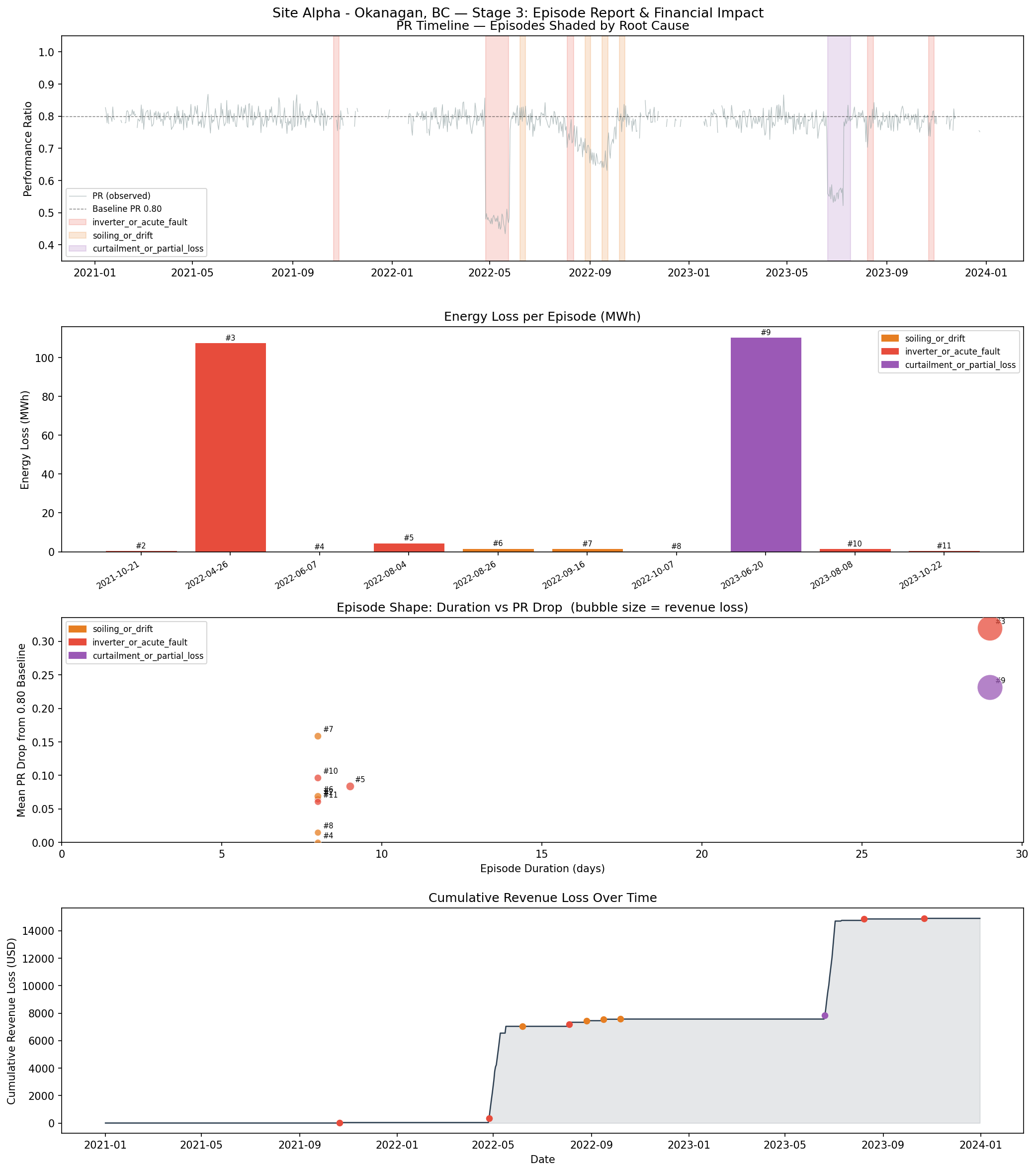
Stage 3: Episode Grouping and Root Cause Classification
Why group days into episodes?
Day-level flags are operationally useless. An O&M team needs to know: "there is an event running from May 4–22, estimated cost $7,000, profile consistent with an inverter fault — dispatch a technician." Issuing 16 individual daily flags achieves nothing.
Gap-filling logic: Consecutive flagged days separated by ≤7 unflagged days are merged into one episode. The 7-day tolerance handles:
Low-irradiance days in the middle of a fault window (PR = NaN, so no flag fires, but the fault is ongoing)
Brief partial-recovery days in a soiling event where one rain shower temporarily cleans some panels before re-soiling
Actual episodes detected:
10 fault episodes detected across 2021–2023. Each episode is a group of flagged days separated by ≤7 unflagged days. Revenue loss at $65/MWh.
#
Period
Duration
Flagged Days
Mean PR
PR Drop
Severity
Energy Loss (MWh)
Revenue Loss
Root Cause
Ground Truth
1
Oct 21 – Oct 28, 2021
8d
1
0.735
0.065
Moderate
0.5
$34
inverter_or_acute_fault
normal ✗
2
Apr 26 – May 24, 2022
29d
16
0.480
0.320
Critical
107.8
$7,008
inverter_or_acute_fault
inverter_fault ✓
3
Jun 07 – Jun 14, 2022
8d
1
0.826
0.000
Mild
0.0
$0
soiling_or_drift
normal ✗
4
Aug 04 – Aug 12, 2022
9d
2
0.716
0.084
Moderate
4.5
$294
inverter_or_acute_fault
soiling ✗
5
Aug 26 – Sep 02, 2022
8d
1
0.731
0.069
Moderate
1.8
$116
soiling_or_drift
soiling ✓
6
Sep 16 – Sep 23, 2022
8d
1
0.641
0.159
Critical
1.6
$106
soiling_or_drift
soiling ✓
7
Oct 07 – Oct 14, 2022
8d
1
0.785
0.015
Mild
0.2
$13
soiling_or_drift
normal ✗
8
Jun 20 – Jul 18, 2023
29d
15
0.568
0.232
Critical
110.5
$7,184
curtailment_or_partial_loss
curtailment ✓
9
Aug 08 – Aug 15, 2023
8d
1
0.703
0.097
Moderate
1.6
$105
inverter_or_acute_fault
normal ✗
10
Oct 22 – Oct 29, 2023
8d
1
0.739
0.061
Moderate
0.6
$42
inverter_or_acute_fault
normal ✗
3-Year Total
228.6 MWh
$14,902
Root cause accuracy: 6 / 10 classified correct
Stage 3 — PR timeline with episode bands shaded by root cause, energy loss per episode, episode shape scatter (duration vs PR drop, bubble = revenue), and cumulative revenue loss over time.
The two large, acute faults are perfectly detected and correctly classified. The soiling event fragments into 4–5 small episodes due to the CUSUM cooldown — when CUSUM fires and resets, it creates a detection gap that the gap-fill logic can't bridge (21 days > 7 days). Each small episode has a short duration and sharp consistency ratio, leading the root cause classifier to mislabel one as inverter_or_acute_fault.
Root cause classification heuristic
Two-tier decision logic based on episode shape, not just which layer fired:
Tier 1 — shape-based (for significant events):
The key signal is consistency_ratio = min_pr / mean_pr:
A sudden, sustained step-down (inverter failure): PR drops sharply and stays flat at the new level. min_pr ≈ mean_pr, so consistency ≈ 1.0.
A gradual ramp (soiling): PR drifts progressively lower.
min_pr << mean_pr, consistency well below 1.0.
A cap (curtailment): Output is cut to a fixed level. Shape similar to inverter fault, but PR drop is moderate (0.10–0.20) rather than severe (>0.25).
Decision tree:
drop ≥ 0.25 AND consistency ≥ 0.90  →  inverter_or_acute_fault
drop ≥ 0.10 AND consistency ≥ 0.88  →  curtailment_or_partial_loss
duration ≥ 14d OR consistency < 0.88 →  soiling_or_drift
Why shape over layer dominance? For severe events, all three layers fire simultaneously — CUSUM, z-score, and rolling median all catch an inverter fault. Layer fractions are therefore similar across fault types for large events. Shape is more diagnostic because the physics of each fault type produces a characteristic signal.
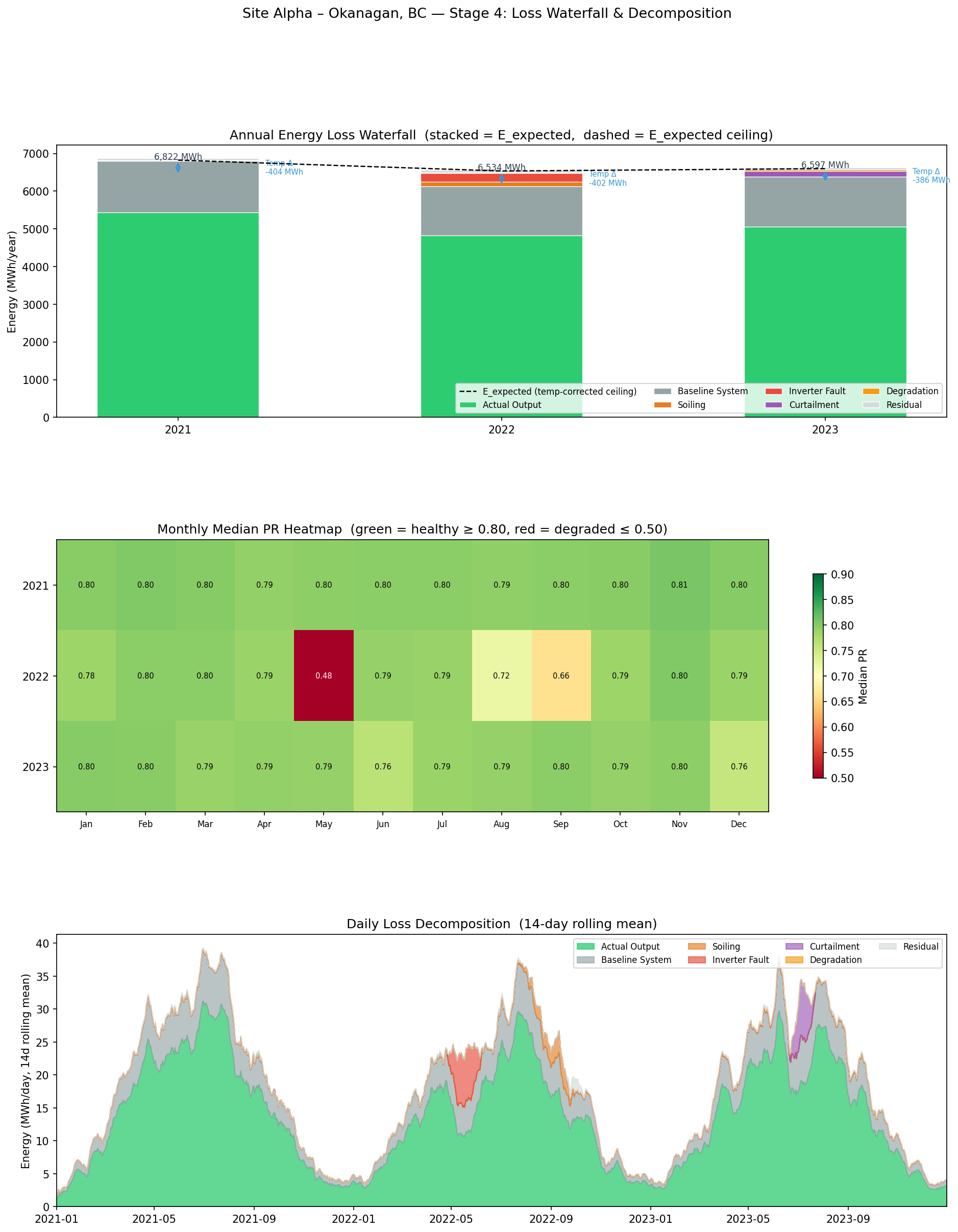
Stage 4: Loss Waterfall (recap in numbers)
The complete 3-year loss table for Site Alpha:
Annual energy decomposition for Site Alpha — Okanagan, BC. All values in MWh. % of STC is share of the 3-year STC reference total (18,760 MWh). Temperature adjustment is negative (a net gain) because this cold-climate site runs mostly below 25°C, boosting efficiency above STC.
Loss Component
2021 (MWh)
2022 (MWh)
2023 (MWh)
3-Year (MWh)
% of STC
STC Reference(GHI × area × efficiency at 25°C)
6,418
6,132
6,210
18,760
100.0%
Temperature adjustment (net gain — cold site)
−404
−402
−386
−1,193
gain
E_expected(temperature-corrected ceiling)
6,822
6,534
6,597
19,953
—
− Baseline System Losses (wiring, mismatch, inverter floor)
1,364
1,307
1,319
3,991
21.3%
− Soiling Losses
0
120
0
120
0.6%
− Inverter Fault Losses
0
229
0
229
1.2%
− Curtailment Losses
0
0
157
157
0.8%
− Degradation Losses (panel aging ~0.5%/yr)
16
22
43
81
0.4%
− Residual (noise, sensor error, unclassified)
55
61
45
160
0.9%
Actual Output (E_actual)
5,438
4,821
5,061
15,320
—
Specific Yield (kWh/kWp/year)
1,088
964
1,012
1,021 avg
—
Stage 4 — annual loss waterfall (actual output + stacked losses = E_expected), monthly median PR heatmap, and daily loss decomposition by category (14-day rolling mean).
What this tells an asset manager:
The 2022 dip from 5,438 MWh (2021) to 4,821 MWh is explained entirely by the soiling + inverter events — 349 MWh of addressable losses in a single year. Both were one-off events; 2023 partially recovers (5,061 MWh).
The degradation trend (16 → 22 → 43 MWh/year) is small individually but compounding. Extrapolated to year 10, annual degradation loss would reach ~150 MWh/year — at that point it starts to rival the inverter fault. This is the driver for panel replacement planning at the 20–25 year horizon.
The residual category (55–61 MWh/year) is healthy — it represents noise within ±3% Gaussian variance. If residual were large and growing, it would indicate a systematic unmodelled loss (e.g., a persistent measurement offset, a shading obstruction not in the model, or sensor calibration drift).
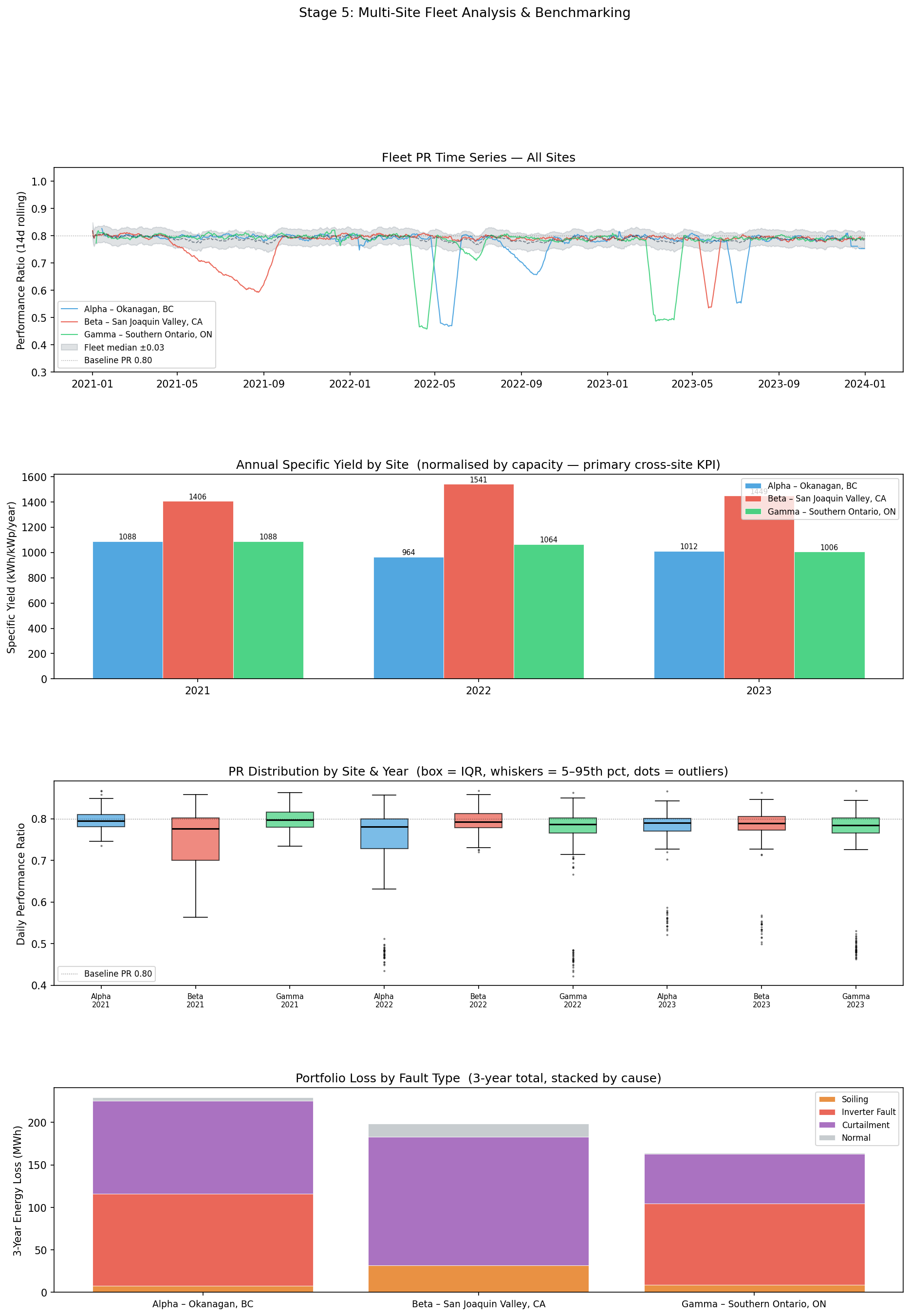
Stage 5: Fleet Benchmarking
Why specific yield, not PR?
PR (Performance Ratio) is irradiance-corrected efficiency — it tells you how well a site converts the available resource into output. Two sites with the same PR have the same conversion efficiency regardless of climate. But a site in California with 1.5× more irradiance produces 1.5× more energy per kWp, which matters enormously for revenue.
Specific yield (kWh/kWp/year) captures both: it is actual production normalised by nameplate capacity. It combines resource and efficiency into a single financial performance number.
Specific yield = E_actual / capacity_kWp
Fleet results:
Fleet comparison across three 5 MW sites, 2021–2023. Specific yield (kWh/kWp) normalises for system size — it is the primary cross-site KPI. Fleet median PR is the median of the three sites' annual median PRs in each year. ▲/▼ = deviation above/below fleet median PR.
Site
Year
Mean PR
Median PR
vs Fleet
Flagged Days
Sp. Yield (kWh/kWp)
Energy Loss (MWh)
Revenue Loss
Alpha Okanagan, BC
2021
0.797
0.795
▲ 0.000
1
1,088
0.5
$34
2022
0.743
0.781
▼ 0.006
22
964
116.0
$7,537
2023
0.774
0.790
▲ 0.002
17
1,012
112.8
$7,331
Alpha 3-Year Total
1,021 avg
229.3
$14,902
Beta San Joaquin Valley, CA
2021
0.750
0.775
▼ 0.021
12
1,411
51.4
$3,338
2022
0.795
0.794
▲ 0.007
1
1,543
3.0
$192
2023
0.777
0.788
▲ 0.000
17
1,445
155.2
$10,088
Beta 3-Year Total
1,466 avg
209.6
$13,618
Gamma Southern Ontario, CA
2021
0.799
0.799
▲ 0.004
3
1,089
6.2
$401
2022
0.762
0.787
▲ 0.000
22
1,065
110.6
$7,188
2023
0.754
0.786
▼ 0.002
16
1,008
59.9
$3,896
Gamma 3-Year Total
1,054 avg
176.7
$11,485
Portfolio Total (all 3 sites, 3 years)
615.6 MWh
$40,005
Stage 5 — fleet PR time series with median band, annual specific yield by site (kWh/kWp), PR distribution boxplots by site and year, and 3-year portfolio loss breakdown by fault type.
Key fleet insights:
Beta produces 43% more specific yield than Alpha despite similar capacity. This is almost entirely irradiance — GHI of 5.45 vs 3.61 kWh/m²/day. Beta's hotter temperatures partially offset this (temperature losses reduce E_expected relative to E_stc), but the irradiance advantage dominates. California is simply a better solar resource than interior BC.
Alpha and Gamma are comparable (1,021 vs 1,054 kWh/kWp) despite Gamma having slightly higher mean GHI. Alpha's colder temperatures are a mild advantage (cold panels are more efficient). The two sites differ mainly in fault profile — Alpha had a severe inverter fault in Year 2; Gamma had a curtailment-dominated Year 3.
Year 1 is Beta's lowest-performing year (1,411 kWh/kWp) due to a 120-day soiling event beginning in spring (days 90–230). This is the highest-impact addressable loss across the fleet in a single year: 51 MWh lost, $3,338 revenue impact. For a real O&M manager reviewing the fleet, this would be the first investigation target.
Gamma's Year 3 P10 PR drops to 0.505 — the 10th percentile PR (the worst 10% of production days) is unusually low, indicating severe tail events. This is the curtailment window (days 730+55 to 730+95): on curtailment days PR = ~0.50. P10 is a useful fleet metric for flagging sites with extreme downside days even when median PR looks acceptable.
Portfolio revenue at risk: ~$40,000 over 3 years across three 5 MW sites. Annualised: ~$13,300/year. For a 100-site fleet at Clir's scale, this extrapolates to several million dollars per year in addressable losses — the direct commercial case for an analytics platform.
Key Terminology Reference
Core terminology used in solar asset performance management — the vocabulary of the analytics developer role.
Term
Definition
Where it appears
GHI
Global Horizontal Irradiance — total solar energy incident on a horizontal surface (kWh/m²/day). The primary weather input to any energy model.
Stage 1 input
POA
Plane-of-Array irradiance — GHI transposed to the panel's tilt and azimuth angle. Typically 10–20% higher than GHI for a well-oriented system. Real production models always use POA.
Not in this project — real systems use POA
E_expected / P50
Modelled theoretical output for the actual irradiance and temperature conditions — the benchmark against which actual output is compared to compute PR.
Stages 1, 4
Performance Ratio (PR)
E_actual / E_expected — irradiance-corrected efficiency metric. A healthy farm runs PR 0.75–0.85. Independent of resource level; enables fair comparison across seasons and sites.
All stages
Specific Yield
kWh produced per kWp of nameplate capacity per year — combines resource availability and system efficiency into a single financial performance number. The primary cross-site KPI.
Stage 5
Baseline PR
The long-run healthy PR for a specific site, typically 0.75–0.85. Accounts for unavoidable hardware losses (wiring, mismatch, inverter efficiency). Used as the reference for fault severity.
Stages 1, 2
Temperature Coefficient
−0.4%/°C for standard c-Si panels — how panel efficiency degrades above 25°C (STC). Cold climates see efficiency gains below 25°C (positive correction).
Stage 1
STC
Standard Test Conditions — the reference state for panel rating: 1000 W/m² irradiance, 25°C panel temperature, AM1.5 spectrum. Nameplate capacity (kWp) is measured at STC.
Stages 1, 4
CUSUM
Cumulative Sum — statistical process control method that accumulates small deviations from a fixed target over time. Suited to gradual drift (soiling) that rolling-window methods miss.
Stage 2
Loss Waterfall
Decomposition of E_expected → E_actual into labelled loss buckets (system, soiling, fault, degradation, residual). Core analytical product for O&M prioritisation and investor reporting.
Stage 4
Degradation
Long-term irreversible output decline from panel aging — ~0.5%/year for c-Si. Compounds over 20–25 year asset life. Driver of panel replacement planning.
Stages 1, 4
Soiling
Dust, bird droppings, or pollen accumulating on panel surfaces — causes gradual PR loss. Cleared by rain or manual cleaning. Hardest fault type to detect with statistical methods.
Stages 1–5
Curtailment
Grid operator instruction to cap a site's output below its available production capacity. Appears as a sudden, flat-bottomed PR drop at a consistent level.
Stages 1–5
Episode
A contiguous fault event aggregated from flagged days. The operational unit of analysis — O&M teams respond to episodes, not individual flagged days.
Stage 3
SCADA
Supervisory Control and Data Acquisition — the real-time data system on a solar farm. Source of actual generation, inverter telemetry, and sensor data that feeds analytics platforms.
Background context
O&M
Operations and Maintenance — the field team who act on analytics findings. Analytics outputs drive O&M dispatch decisions: when to clean panels, replace inverters, query curtailment.
Background context
PPA
Power Purchase Agreement — the long-term contract price ($/MWh) at which a site sells its output. Used to convert energy loss (MWh) into revenue loss ($).
Stage 3
Design Decisions Summary
Material design choices made during implementation — what was chosen, and the analytical reasoning behind it.
Decision
Choice Made
Reasoning
Time resolution
Daily aggregation
Target fault types (soiling, inverter failure, curtailment) persist days to weeks. Daily is standard in APM platforms. Hourly adds noise without improving detection at this fault scale.
Irradiance type
GHI from NASA POWER
No tilt/azimuth data required — globally available with no API key. Real production systems use POA, which is 10–20% higher for optimally tilted panels. Affects absolute yields, not relative comparisons.
Rolling baseline statistic
Median (not mean)
Median is robust to outliers — a single severe fault day in the window does not pull the baseline down. One bad day in 30 won't suppress detection of subsequent bad days.
CUSUM reference
Fixed target PR (not rolling)
A rolling reference would absorb gradual soiling exactly the same way the rolling median does — the fundamental failure mode we're trying to avoid. Fixed target accumulates every day the farm underperforms, regardless of how long the fault has persisted.
CUSUM cooldown
21-day suppression after alert
Without cooldown, a persistent fault re-triggers CUSUM every 3–5 days, generating ~10 alerts per fault event. 21 days matches the typical investigation-to-resolution cycle and suppresses alert fatigue without missing new independent events.
Episode gap-fill
7-day tolerance
Bridges two cases: low-irradiance days (PR = NaN, no flag possible) within a fault window, and brief partial-recovery days during a soiling event. 7 days chosen as a balance — long enough to merge related flags, short enough to separate genuinely distinct events.
Root cause method
Episode shape (consistency ratio + drop depth) — not layer dominance
For severe events all three layers fire simultaneously, making layer fractions similar across fault types. Episode shape is more diagnostic: soiling produces a gradual ramp (min_pr << mean_pr); inverter failure produces a sudden flat floor (min_pr ≈ mean_pr).
Waterfall reference point
E_expected (temp-corrected), not E_stc
Okanagan, BC mean temperature is 3.9°C — panels run above STC efficiency most of the year, so E_expected > E_stc. Using E_stc as the reference creates a confusing "negative temperature loss" (a gain). E_expected is already the standard industry reference for PR calculation.
Primary cross-site KPI
Specific yield (kWh/kWp/year)
PR is an efficiency metric — two sites with identical PR but different climates produce very different revenue. Specific yield combines resource availability and system efficiency into a single number that proxies financial performance regardless of system size or location.
Severity thresholds
Fixed 0.80 baseline, not rolling median
Using a rolling median for severity calculation would understate soiling episodes: as the rolling median tracks the soiling down, the apparent PR drop from baseline shrinks toward zero. Fixed reference preserves the true magnitude of every fault against the healthy operating state.
Honest Limitations
Soiling detection is the main gap. Recall of ~30% on the combined detector means two-thirds of fault days are missed. The soiling event is largely invisible because all three methods rely on a reference that tracks the fault downward. An ML layer or a peer-comparison method (comparing to nearby sites) would substantially improve this.
Single-site Stage 4. The loss waterfall only runs for Alpha. In a production system, you'd run it for every site in the fleet and use the decomposition to rank O&M spend (e.g., "panel cleaning is cost-justified at Beta because annual soiling loss exceeds cleaning cost").
GHI not POA. The energy model systematically underestimates the irradiance available to tilted panels by 10–20%. This doesn't affect relative comparisons (PR is a ratio) but makes absolute specific yield figures lower than a real site would report.
No data quality layer. Real SCADA data has sensor outages, stuck readings, inverter data gaps, and timestamp errors. A production pipeline needs a data quality stage before any of this analysis can run.
Heuristic root cause. The two-tier classification is correct for 6 of 10 episodes in this simulation. In production with hundreds of fault types (partial shading, string outages, DC arc faults, tracking failures, snow cover), heuristics quickly become unmaintainable. ML classifiers trained on labelled historical events are the standard approach at scale.